Sunday, February 16, 2020
Week 4 Post 2 | My Website Critques
After my last post about what websites were doing wrong, I'd like to talk about two websites that do things right. The concept of "right" can be summed up with only two definitions; it's aesthetically pleasing and it's easy to use. These two websites do these two things well, and enjoy the benefits of good traffic that comes and stays a while.
YouTube
Everyone knows YouTube, and while it's well stocked with cat videos and how to's, YouTube is actually very thoughtfully designed. Upon loading, visitors are greeted with two rows of recommended/subscribed videos in the center of the screen. The eye immediately goes to this area - and that's a smart move on the part of the YouTube designers. By putting the content that you're most likely to engage with front and center, you're more likely to click. They add more value to these recommended videos by including clear uploader-provided titles and timestamps right along the video and also having them autoplay for a few seconds if you mouse over. This can help users make quick judgements about if they want to watch the video or not. Then, as the user scrolls down a bit more (below the fold), they are greeted with a single row of newsworthy videos. Then, below that, it's back to the recommended videos. All of the videos are arranged into a neat grid based on your screen size (or a single column on mobile) - making a colorful, graphical repeat as you scroll.
As an accessory to the visuals of the videos, users have very fast access to custom searches by way of a persistent top search bar. This search bar is easy to use, and has a keyword match function as the user types to help narrow down what videos to search for. This search has a side effect of sometimes autofilling suggestions that the user may not have thought of, leading to interesting explorations through YouTube. Account maintenance, playlists, and quick links to subscribed channels are easily available though a left side navigation bar on the home page. The overall design is simple, with a clean grid layout and simple typography that utilizes excellent typography to clearly highlight what information is important.
The user experience is also enhanced for video watching - with the availability of several view modes users can choose how they prefer to watch, and additional functionality tucked away under various easy to find buttons controls playback speed, captions, and translations.
As for improvements, YouTube would benefit from not forcing certain playback features on users, such as the autoplay feature. As many times as I've disabled it, it still sneaks back to enabled and that's not always what I want. Its user metrics for recommendations could also use a little tinkering, as over and over again it recommends the same videos I'm not interested in or videos that I've already watched.
All of this user-centered design and ability to customize the experience helps YouTube to deliver an excellent experience for its visitors - regardless of if they're there to find something specific or just to waste time.
Zillow
Real estate site Zillow also does an excellent job in user design as well. Upon first loading the site, visitors are greeted with a peaceful, stylish photo of a home that changes on occasion to keep things fresh. Today, that photo is a dusk photo of a peaceful Cape Cod style beach bungalow - immediately making the visitor ponder summer nights at the shore around a cozy fire and s'mores. The photo effectively gets users thinking of the possibilities in their real estate searching and ultimate purchase (if they get that far). A search box is prominently placed over the photo to encourage users to get started in their search. The site features little more above the fold aside from some basic navigational elements. Below the fold Zillow provides information on how they work as well as links to mortgage information - helpful additions to users who are just beginning a real estate purchase and may not quite know where to start.
Upon performing a search, users are taken to a clean, grid-designed result that features a prominent map search feature as well as individual real estate listings organized into several rows. The listings also feature quick information with an eye to typography - it's easy to get their address, price, and status, as well as know if there's additional sales features available like a 3D tour. It's easy to adjust the map, search parameters, and click into listings to get more information. Helpful flyouts provide more information on moused-over areas so users can get quick info to help them decide whether to click into something or not.
Zillow works much like YouTube in that it lets the content create the visual interest. There's very little decoration or design to the site other than its strong, easy to navigate layout. One downfall of the site, though, is that its blue color for branding is somewhat harsh on my screen. I feel like it competes for visual attention with the other important elements on the page, and that is a bit distracting. I also find that the overlay-style real estate listings require more scrolling than I'd like - making them into their own page like Redfin does allows for more columns in the design, and therefore more content up higher.
All in all, there are some heavy hitters in the online real estate market and while they use similar features, one way they can differentiate is in design. Zillow achieves this easily with a heavy emphasis on featuring imagery in a way that helps them to do the talking.

Thursday, February 13, 2020
Week 4 Post 1 | Website Critiques
This week we're looking at websites and asking ourselves "What are they doing well? How could they improve? And where do they just need to start over?" Despite the internet maturing to where it is now, admittedly not everyone is a web designer or knows the principles of web design. And yet, some do it extremely well. Here's a small collection of thoughts on four websites:
The Bad
Jami Lin's Passions - This website caught my attention because I immediately didn't know where my attention should go. There's quite a few concerns with this website design, namely with hierarchy of content, navigation, "tone", and typography. The site's hierarchy struggles because there's no focus; all of the text is smashed together into a narrow column (I'm guessing this site is from the 1024x768 days), roughly all the same size, and there's little imagery to direct us quickly to what things are. In addition, all of the content seems in conflict with each other. One area talks about Feng Shui, another real estate, then chakras, then its owner, and then anti-aging products. What is this site selling? The most eye catching element is the top header, but it's wild and garish in and of itself. Its navigation also struggles - I count at least three separate menus.and am not sure which one would take me where I want to go. And, the astonishing thing is that for as much content is on the front page there's...even more pages with even more content.
My major concern with this site is that it deals with traditional beliefs of thought that have to do with inner peace, peace within an environment, and balance. A business should convey their tone by way of their website, and no part of this site brings me "peace". It's cluttered, spastic in thought, and uses garish colors. If nothing else, it makes me worry that I'm going to get a computer virus from the assorted ads. The typography is also a struggle because it is all consistent - there's very little in the way of headers to distinguish sections of copy. I feel like every section is shouting for attention all at once.
This site also has major SEO issues (keyword stuffing, image-based text in the most important places, unclear navigation and headers, duplicate text, and more).
How could this be fixed? The first task would be to refine all of the content. All of the content needs to be consolidated into sections of thought. I would imagine that if you really picked this site apart you'd find that a lot of the text repeats and could be simplified significantly. Then, all but the most important information needs to be organized into pages under one menu. The next step would be to sort out the website design to fit the product it's selling. A website theme with a more simple layout and lots of white space would help to bring peace to the site, as would nice images of Feng Shui in use. Information about blog posts and more "train of thought" information could be neatly placed at the bottom of the page where it's still easily findable, but not screaming for attention.
Gates N Fences - This website also has some major struggles. Like the previous site, it struggles from trying to say too much at once with poor typography and hierarchy. The design is also especially problematic, and the methods they used to counteract it only make it worse.
By placing every single thing they want to say about the business right on the front page I don't even know where to start reading. The key with web design is getting your point across in mere seconds, and I have to admit it took me more than a moment to even figure out what this company does. There is no hierarchy to what they're trying to say - everything is coming at me all at once. Plus, the text is all too small to read. There's no change in typography to help emphasize points or separate content. Even links use the default blue color when that's easily changed in the site CSS. The website navigation also needs to be refined - it's another case of cramming in whatever they could think up as "possibly being important". It also takes a lot of scrolling to view it all, and likely important sections are getting lost to the SEO because they reside below the page fold (the viewable area when first loading the site). Much of this menu could be refined into a 2-3 level menu that simplifies information into sections so that certain customers know where to find content, and others can find other content.
The design of the site is also troublesome with a repeating pattern in the background and nothing to isolate page elements from it. To counteract this, they simply dropped all text onto gray backgrounds that clash and all images sit on white backgrounds. There are also major SEO issues on this site too - keyword stuffing, lack of headlines, lack of focus, and more.
To fix this site I would suggest starting by refining the content more carefully. What products do they sell? Make those navigation headers. What would they say about their company if they only had three seconds to say it? Make that the most apparent text when the site loads. And then I'd build out a much better layout that better isolates the page elements from the background (such as on a white background). This helps the text and imagery to pop better. The typography could also be spruced up with better headlines and font sizes. Then, I'd suggest moving all subtopics under their appropriate menu as flyouts to help clear the clutter. And, given that this company focuses on a very visual product, get some of those pretty pictures front and center. Let potential customers see your capabilities without saying a word.
The Good
In contrast, there are some excellent websites out there too!
Toyota - The Toyota website shines by being focused without fluff, much like their vehicles. Immediately I am presented with hierarchy - the four links at the bottom of the screen to build a vehicle, find a dealer, and more. Were I in the market for a Toyota that's certainly information I'd be looking for. Then, an animation loads and loops to keep visual interest, plus offers enticement to travel to another part of the site to view a commercial. This is an excellent teaser that doesn't compete with the rest of the site. And then, I notice the navigation waiting patiently at the top of the screen for any additional needs I may have. A little more scrolling reveals easy links to specific vehicles below the fold - indicated with a picture of the vehicle. This helps to solidify recognition of the vehicles, and satisfies the visitors that only know what a car looks like and not necessarily its name. The design aesthetic is clean and with a minimal palette, and the color red indicating things that I can do.
Toyota's careful design of their site leaves me feeling like I can easily figure out where to go to find the information I want. I happen to be a bit of a car nerd so I'm already familiar with all of their products and where they sit in the market, but this site is exceptionally digestible to those who perhaps aren't as savvy. Those visitors could shop by car category, price, and more easily. The entire site is clear and pragmatic, which is what I would expect from Toyota.
National Park Service - The NPS website is another example of an extremely well done site. Immediately I am greeted with their highlighted story on African American Heritage with a clear link of how to get to it. Below it in hierarchy sits three more highlighted stories, each also supported with clear imagery that conveys the message of the story. And then, my eye notices the drop down selector for parks within the system. Perhaps I came to this site looking for information on a specific park, but I was also gifted with other learning opportunities too. Scrolling below the fold reveals more highlighted stories and sections of the website that I may visit, all with clean, clear typography and earthy colors. I haven't visited many national parks, but it is certainly on my bucket list. Showing me beautiful pictures of the outdoors is something that certainly gets me excited to continue digging through the site. Expanding the navigation reveals many more subcategories that help visitors find what they're looking for. And then, it collapses out of the way.
The simple design of the site leaves me pondering the simplicity of the outdoors. I also appreciated how easy it was to find information in the first place - either through menus or the search box. The design leaves me feeling like I can quickly find exactly what I'm looking for, with some bonus information along the way if I want it too.
The Bad
Jami Lin's Passions - This website caught my attention because I immediately didn't know where my attention should go. There's quite a few concerns with this website design, namely with hierarchy of content, navigation, "tone", and typography. The site's hierarchy struggles because there's no focus; all of the text is smashed together into a narrow column (I'm guessing this site is from the 1024x768 days), roughly all the same size, and there's little imagery to direct us quickly to what things are. In addition, all of the content seems in conflict with each other. One area talks about Feng Shui, another real estate, then chakras, then its owner, and then anti-aging products. What is this site selling? The most eye catching element is the top header, but it's wild and garish in and of itself. Its navigation also struggles - I count at least three separate menus.and am not sure which one would take me where I want to go. And, the astonishing thing is that for as much content is on the front page there's...even more pages with even more content.
My major concern with this site is that it deals with traditional beliefs of thought that have to do with inner peace, peace within an environment, and balance. A business should convey their tone by way of their website, and no part of this site brings me "peace". It's cluttered, spastic in thought, and uses garish colors. If nothing else, it makes me worry that I'm going to get a computer virus from the assorted ads. The typography is also a struggle because it is all consistent - there's very little in the way of headers to distinguish sections of copy. I feel like every section is shouting for attention all at once.
This site also has major SEO issues (keyword stuffing, image-based text in the most important places, unclear navigation and headers, duplicate text, and more).
How could this be fixed? The first task would be to refine all of the content. All of the content needs to be consolidated into sections of thought. I would imagine that if you really picked this site apart you'd find that a lot of the text repeats and could be simplified significantly. Then, all but the most important information needs to be organized into pages under one menu. The next step would be to sort out the website design to fit the product it's selling. A website theme with a more simple layout and lots of white space would help to bring peace to the site, as would nice images of Feng Shui in use. Information about blog posts and more "train of thought" information could be neatly placed at the bottom of the page where it's still easily findable, but not screaming for attention.
Gates N Fences - This website also has some major struggles. Like the previous site, it struggles from trying to say too much at once with poor typography and hierarchy. The design is also especially problematic, and the methods they used to counteract it only make it worse.
By placing every single thing they want to say about the business right on the front page I don't even know where to start reading. The key with web design is getting your point across in mere seconds, and I have to admit it took me more than a moment to even figure out what this company does. There is no hierarchy to what they're trying to say - everything is coming at me all at once. Plus, the text is all too small to read. There's no change in typography to help emphasize points or separate content. Even links use the default blue color when that's easily changed in the site CSS. The website navigation also needs to be refined - it's another case of cramming in whatever they could think up as "possibly being important". It also takes a lot of scrolling to view it all, and likely important sections are getting lost to the SEO because they reside below the page fold (the viewable area when first loading the site). Much of this menu could be refined into a 2-3 level menu that simplifies information into sections so that certain customers know where to find content, and others can find other content.
The design of the site is also troublesome with a repeating pattern in the background and nothing to isolate page elements from it. To counteract this, they simply dropped all text onto gray backgrounds that clash and all images sit on white backgrounds. There are also major SEO issues on this site too - keyword stuffing, lack of headlines, lack of focus, and more.
To fix this site I would suggest starting by refining the content more carefully. What products do they sell? Make those navigation headers. What would they say about their company if they only had three seconds to say it? Make that the most apparent text when the site loads. And then I'd build out a much better layout that better isolates the page elements from the background (such as on a white background). This helps the text and imagery to pop better. The typography could also be spruced up with better headlines and font sizes. Then, I'd suggest moving all subtopics under their appropriate menu as flyouts to help clear the clutter. And, given that this company focuses on a very visual product, get some of those pretty pictures front and center. Let potential customers see your capabilities without saying a word.
The Good
In contrast, there are some excellent websites out there too!
Toyota - The Toyota website shines by being focused without fluff, much like their vehicles. Immediately I am presented with hierarchy - the four links at the bottom of the screen to build a vehicle, find a dealer, and more. Were I in the market for a Toyota that's certainly information I'd be looking for. Then, an animation loads and loops to keep visual interest, plus offers enticement to travel to another part of the site to view a commercial. This is an excellent teaser that doesn't compete with the rest of the site. And then, I notice the navigation waiting patiently at the top of the screen for any additional needs I may have. A little more scrolling reveals easy links to specific vehicles below the fold - indicated with a picture of the vehicle. This helps to solidify recognition of the vehicles, and satisfies the visitors that only know what a car looks like and not necessarily its name. The design aesthetic is clean and with a minimal palette, and the color red indicating things that I can do.
Toyota's careful design of their site leaves me feeling like I can easily figure out where to go to find the information I want. I happen to be a bit of a car nerd so I'm already familiar with all of their products and where they sit in the market, but this site is exceptionally digestible to those who perhaps aren't as savvy. Those visitors could shop by car category, price, and more easily. The entire site is clear and pragmatic, which is what I would expect from Toyota.
National Park Service - The NPS website is another example of an extremely well done site. Immediately I am greeted with their highlighted story on African American Heritage with a clear link of how to get to it. Below it in hierarchy sits three more highlighted stories, each also supported with clear imagery that conveys the message of the story. And then, my eye notices the drop down selector for parks within the system. Perhaps I came to this site looking for information on a specific park, but I was also gifted with other learning opportunities too. Scrolling below the fold reveals more highlighted stories and sections of the website that I may visit, all with clean, clear typography and earthy colors. I haven't visited many national parks, but it is certainly on my bucket list. Showing me beautiful pictures of the outdoors is something that certainly gets me excited to continue digging through the site. Expanding the navigation reveals many more subcategories that help visitors find what they're looking for. And then, it collapses out of the way.
The simple design of the site leaves me pondering the simplicity of the outdoors. I also appreciated how easy it was to find information in the first place - either through menus or the search box. The design leaves me feeling like I can quickly find exactly what I'm looking for, with some bonus information along the way if I want it too.
Sunday, February 9, 2020
Week 3A: Blog Postings
This week I commented on the posts of Patricia Rabito, Sandra Sanchez, and Miguel Velasco.
Friday, February 7, 2020
Week 3 Post 2 | Stained Glass + Social Media
As I will be focusing on the social media for my stained glass business this semester, I’ve researched the social media habits of a variety of companies within the stained glass market. For reference, the term “art glass” refers to manufactured decorative glass intended to be cut further and assembled into glass works. The term “glass art” refers to any art created from glass, such as stained glass, kiln-fired fused glass, blown glass, or lampwork pieces. My list of companies is as follows:
Kokomo Opalescent Glass
https://www.kog.com/
Kokomo Opalescent Glass, based in Kokomo, IN, is a leading manufacturer of art glass and is a medium size international company. They utilize Facebook and Twitter for their social media, and I also found their unadvertised channel on YouTube. However, their social media links on their website point to the platforms themselves – not their business pages – leading me to have to search for them. A simple oversight that is surely hurting them from a SEO standpoint! Their social media metrics are as follows:
Social Platform
|
Date of Last Post
|
Average Posts/Day
in 2020
|
Number of Followers
|
Facebook
|
February 6, 2020
|
2.05
|
15,731
|
Twitter
|
February 3, 2020
|
.2
|
860
|
YouTube
|
September 6, 2016
|
0
|
146
|
As you can see, they are focusing their SEO labor where it matters, which is Facebook. However, in scrolling through their posts from this year most of them were simply event pages for classes they were putting on. As a follower from a more than a thousand miles away, posts about classes don't do much for me. And, clearly not for others either as the posts that were not geographically limiting had much higher engagement. Their Twitter account is fairly quiet as well, and their YouTube efforts are dead. I find the last one a bit disappointing because the process of making art glass is actually pretty neat to watch - they could certainly drum up interest in the company by posting neat videos about their product! However, I think what's at play here is their target market. Stained glass crafting is predominately done by retirement-age people, and they don't really hang out on Twitter or YouTube. But everyone has a grandma on Facebook. If Kokomo had to choose one platform to focus on I agree, Facebook is it.
Delphi Glass
https://www.delphiglass.com/
Delphi Art Glass is a leading vendor of art glass and supplies for making stained glass panels. They are a Lansing, MI – based medium size international company that has a local storefront (that also offers classes) and a robust online sales business. They utilize a variety of social media platforms for their business (easily found on their webpage); Facebook, Twitter, Instagram, Pinterest, and YouTube. Their social media metrics are as follows:
Social Platform
|
Date of Last Post
|
Average Posts/Day
in 2020
|
Number of Followers
|
Facebook
|
February 4, 2020
|
.28
|
28,133
|
Twitter
|
June 30, 2019
|
0
|
1,530
|
Instagram
|
February 4, 2020
|
.15
|
6,992
|
Pinterest
|
dates not listed
|
dates not listed
|
2.5 million "monthly viewers"
|
YouTube
|
October 24, 2019
|
0
|
19,200
|
Delphi has similar metrics to Kokomo, and I think for the same reason of their target market being more on Facebook than anywhere else. I did notice, however, that their Instagram posts got much more engagement than on Facebook, and perhaps that's because the platform forces them to focus on sharing quality photos of finished works instead of sales notifications and the like. Their YouTube channel could be much better utilized as well, as I have most certainly turned to YouTube for a technique tutorial or to better understand a new product. YouTube videos cross post to Facebook very nicely, and this would in turn drive engagement and interest in their product (especially if they were showing off new glass!).
Blue Dolphin Stained Glass
http://www.bluedolphinglass.com/
Blue Dolphin Stained Glass is a San Diego-based “mom and pop” art glass and stained glass supplies store that also offers classes on-site. They do not ship products and are a small, local business with only about five employees that I’ve seen. They utilize Facebook for their social media promotion and their page is not advertised on their website. Their social media metrics are as follows:
Social Platform
|
Date of Last Post
|
Average Posts/Day
in 2020
|
Number of Followers
|
Facebook
|
December 25, 2019
|
0
|
140
|
There is not much going on here, unfortunately. And, in scrolling through their posts it's mostly "business-y" type content. No pictures of students' works, profiles on their employees, or showcasing new products. The biggest advantage to their store is being able to select your pieces of glass (they are each unique!) and it would do them well to showcase that, plus you get the satisfaction of supporting a small business. And, I'm sad to say, the last few times I've made the 40 minute trek down to the store I've not been able to find what I'm looking for and have had to turn to Delphi and wait a week for it to arrive.
Holdman Studios
https://www.holdmanstudios.com/
Holdman Studios is a Lehi, UT based glass art production studio that specializes in manufacturing and restoring stained glass. They are a medium-size international company and are well known for manufacturing the stained glass panels used in the construction of Mormon temples. They utilize a variety of social media platforms for their business promotion, such as Behance, Instagram, Pinterest, LinkedIn, Twitter, and Facebook, which are all easily found on their website. Their social media metrics are as follows:
Social Platform
|
Date of Last Post
|
Average Posts/Day
in 2020
|
Number of Followers
|
Behance
|
February 8, 2017
|
0
|
n/a
|
Instagram
|
February 6, 2019
|
.07
|
2,903
|
Pinterest
|
dates not listed
|
dates not listed
|
66,700 "monthly viewers"
|
LinkedIn
|
n/a
|
0
|
55 connections
|
Twitter
|
February 3, 2020
|
.21
|
172
|
Facebook
|
February 3, 2020
|
.21
|
6,541
|
Unlike the other businesses I've listed, Holdman does a good job of mixing up their social media content. There's news articles, photos of installations, pieces in progress, and finished works. This keeps their social media interesting and engaging, despite not posting very often. In fact, they have pretty good engagement compared to the other companies (especially on Instagram) despite having only a fraction of the followers. The thing about artists is that we like to see the work of others and appreciate it (and hit Like), and finally a stained glass company is giving us that!
The Season of Glass
No website
The Season of Glass is a business owned and run by sole proprietor Heidi Weghorst Stanhope in New Hampshire. She sells her pieces through a local gallery and an Etsy page that ships worldwide. She does not have a website - I only know about her because she followed my Instagram and I was impressed by her work and followed her back. I was only able to find an Instagram and Facebook page for her business. Her social media metrics are as follows:
Platform
|
Date of Last Post
|
Average Posts/Day
in 2020
|
Number of Followers
|
Instagram
|
February 8, 2017
|
.5
|
1,933
|
Facebook
|
February 6, 2020
|
.57
|
127
|
In comparing her social media efforts, her Facebook page is much more interesting in content, but it gets hardly any engagement. Her Instagram does decently though, and it features lovely photography that shows off her skill (I will nerd out for a second here and say that her lead work - the shiny parts - is legit). I actually asked her for simple advice once and she kindly responded with a helpful suggestion quickly, which was a good effort on her end.
Thoughts
In all, I feel that most of these businesses could be doing social media "better". And by better I mean posting either more often, or posting a greater variety of content. Or, they could be taking advantage of what video would do for their sales and run with it. I feel that many of them are just slapping up ho-hum content and not getting any traction and saying "oh well". Or, another issue could be one that plagues all small businesses on Facebook - the fact that unless you give the mighty Facebook money they won't serve your content to your followers. This is a really discouraging tactic of theirs and it frustrates me to no end. I don't want to run ads - my products sell just fine when people see them. Plus, plenty of my business followers are my actual friends who just want to see what I make because I don't post every last thing to my personal wall. It's interesting comparing the same posts between Instagram and Facebook - the Instagram posts always do better. That's likely because they're served properly, and on top of that a lot of new content can be browsed easily - and that makes for better engagement and more followers.
Of the grouping, I feel that Holdman Studios and The Season of Glass are having the best results with social media despite not posting constantly. Both post a good variety of interesting content as well as eye-pleasing pictures. As I mentioned before, the key to keeping artists as followers is to give them inspiration. You can do this by posting about work in progress (Holdman), or even new ways to use stained glass (The Season of Glass). Heidi's work has got me looking closely to inspect her lead work and dissecting how she makes her glass orchids because I kind of want to try one myself. She also doesn't do the traditional "church window" stained glass style and I try to work in more modern styles too. And Holdman tells a good story. The rest of the bunch just post about sales and closures and classes. Nothing to inspire me as their target market, or engage me into their production process. Kokomo and Delphi would definitely benefit from short videos showcasing their products, but I recognize there's a big time and cost commitment to making those videos look good.
The additional issue of this all is that stained glass crafters as a market are pretty small. A majority of them are Baby Boomer age and older, while there's us young crafters taking new approaches to the ancient art. I do not personally know anyone else who makes stained glass, and it's not really an art that you casually ease into. It's expensive - you're either all in or not. And with such a small market, a majority of which is traditionally limited in their participation with social media, it's hard to market. This isn't a Nike-level fanbase and these are quite often small companies that don't have the budget for serious social media professionals or slick videography. Honestly, it's a tough market, and I've seen it myself.
Wednesday, February 5, 2020
Week 3 Post 1: Business Communication
As a consumer ready to hand over money for a business’s product, nothing is more frustrating than getting silence from that business. It delays you accomplishing your goals, sheds a negative light on that company, and makes you unsure of if you will get what you want out of the transaction. It’s even worse when your options to go to a competitor are limited. I encountered this just last year while filing for guardianship of my nephew. One of the steps that had to be completed before my court date was serving official notice and copies of all the court documents to my sister in law (my brother is deceased, so I didn’t have to serve him). As she’s in a city that’s not close and I have no contacts in, I had to hire a process server to handle the task for me. I set about searching for one online and was immediately presented with a handful of agencies that served her area, and started scouring their websites for ones that looked like some care and attention went into them (a company that puts effort into a good presentation is a good sign for a good product). I found a few, and then started looking for contact information. Many of them required you to call, and I have to say, I hate phones. Plus, with a time difference between here and there, calling meant either getting up early or calling during work hours (which I really wasn’t supposed to do). Ugh. I did, however, find one with an email address! I sent a quick email asking about fees and what they needed and if they were able to complete the proof of service document the court required. And a day or so later, I got an email asking me to call. Ugh again.
I found some time to sneak away from work and made my call, and it was answered by a gruff man who barked off what he needed, how he needed it, and where to send it to. He did not have time for my questions. It was an unpleasant experience. Nevertheless, I sent off my documents with my contact information in case they had a problem…and nothing. For several weeks it was radio silence on my phone and at my mailbox waiting for the proof of service document. Were my documents lost in the mail? My sister in law still hadn’t been served (she knew the forms were coming). I had to pay by money order and the online system showing if it’d been cashed or not returned no information. Ugh. So I called again. And was again greeted by the gruff man who had no time for me and my questions. His response was basically that he doesn’t pay attention to what envelopes come in; he just hands them to “his guy” and it’s out of his hands. A little bit of "Oh yeah, I did see your envelope" would have gone a long way! It was so frustrating and I was just left hoping that the job would be done and I’d get my form in time for my court date. And that I hadn’t just thrown $125 down the drain.
In the meantime, I called another process server in the area just to have a backup in case the first was a bust. I left a message, and didn’t hear back for two weeks.
And then one day, a happy little envelope addressed in my handwriting was in my mailbox (I had sent them a self-addressed envelope to eliminate any chance of issues returning the form). It was the finalized proof of service document! Finally! And then I hustled it off to the courthouse in time for my scheduled hearing.
Overall, I wasn’t expecting much from a process server as they generally don’t have the best reputation. But, this agency went above and beyond in being difficult to communicate with, even when I just had a basic inquiry. Perhaps the emotions were tightened a bit because of the looming court date and paperwork anxieties (there was A LOT of paperwork and five states involved), but overall I hope to never have to deal with another process server again.
Admittedly, I am a fan of written communication and love businesses that allow me to communicate that way. I don't feel right stepping away from work to handle personal calls, and being able to send an email lets me be more productive in handling my matters at night. Another way that we can communicate with a business is through social media - either through reviews, posts, or direct messaging. With the exception of direct messaging, what you say is out there for all to see - good or bad. Had a problem with an order? Tweet it! Want to make a suggestion about a way to improve a product? @ it! Just want to tell them they're doing a good job? Tag it! And, any company that cares about their reputation will act quickly to respond. Social media makes it easier to communicate with a business because it puts them on the spot, and you can often find support from other consumers who respond to you too. Being put on the spot, especially when it's clear that you're not taking care of your customer, is certainly bad publicity for the company and consumers will notice. Even before social media news channels have had consumer advocacy segments where they advocate on behalf of a viewer who has been wronged by a company. And, quite often, the impending bad publicity on the evening news is what gets that company to straighten out and resolve the complaint - often with little effort on the part of the consumer advocate. Funny how that works.
Reviews are also a good way to get the attention of a company. So much of Amazon's business model rides on their 5 star rating system - anything that is below 4 stars or so is not worth buying to many people. Reviews are also a great way for potential customers to understand how the product works, potential issues, and more. Plus, smart companies know that by checking their reviews and making problems right they can win back a customer. But me personally? I really don't leave reviews. I'm just not chatty like that. However, when a product is wildly different than explained or does not work as intended I will may leave a few words as a warning to other potential customers if my concerns haven't already been said. I'm always very to the point and factual with my reviews, and explain how the discrepancy affected me. Being emotional doesn't solve much, and it doesn't give the company concrete information to use to improve.
When it comes to my own business, I respond quickly to all communication that needs a response. Someone have a question? I'll answer it. Someone have a problem? I'll let them know I'll fix it. Customers want to be heard, especially when they feel that their money has been wasted. Because of this I am very mindful of their feedback, especially when it's not great, and also take it as an opportunity to improve. For this class I'll be using my stained glass business as my guinea pig and while my social media posts have gotten very little "negative" attention, if they did I would be all over it. And, depending on the circumstances I would try to leave those comments visible to all so that other users can see me working to solve it and give great customer service. Should someone complain about a piece arriving broken I'd discuss repair with them, and also make a mental note to address my packaging methods. I care very much about everyone enjoying my work and keeping a good name for myself, so every interaction with a customer is a learning opportunity.
Sunday, February 2, 2020
Week 2B: Blog Postings
This week I commented on the blogs of Karen Mendoza, Sandra Sanchez, and Miguel Velasco.
Tuesday, January 28, 2020
Week 2 Post 1: Let's Look at Social Media
Everyone is familiar with social media these days - we all remember getting friend requests from our grandparents and thinking "Well, we've reached peak internet..." Good or bad, social media is here to stay and with it has brought new thinking, capabilities, and connections. How we use those qualities is up to us, but interestingly enough, some platforms are better at that thinking, or capability, or connection than others...but it depends on who you are and what you're trying to do. Are you an average person looking to reconnect with old friends? Or a small-time crafter looking to break into the market? Or a Fortune 500 with something to say? Let's take a look at what social media platforms work well for each use.
For most of us, our first interaction with social media was personal. We'd heard about this new thing called MySpace where you could share posts on your wall, and also deeply personalize your space. You also got to find old friends on there, and everyone with inexplicably friends with Tom. I have to admit that I resisted joining MySpace until my hand was forced with a school project...and that was it. I was hooked with how easy it was to communicate and personalize. And as an introvert, it allowed me to do it all at a distance that was comfortable and controlled. Not too long after a little platform called Facebook appeared and social media as we knew it changed for good. As the hands-down leader of social media, Facebook brings a lot of strengths and unfortunately some downfalls too. But, on the whole, there is a reason it is the #1 social media site for personal use. Over its evolution it's added user-run groups for any special interest the mind could conceive, support for a variety of content formats, easy integration with other websites and apps, and powerful algorithms that help connect its users with people and information that are relevant to them. It's also added a sales platform recently and has firmly established itself as a one stop shop for bringing people together, connecting them to relevant information, and helping to build relationships. For personal use, Facebook reigns supreme and any user can tell you why. Facebook put MySpace out of business and is solidly on the way to sending Craigslist and online forums to their graves too.
But sometimes Facebook is just too...Facebooky. Concerns about privacy, annoyance at the barrage of content, and more has led to the success of other social media platforms for personal use too. Instagram (now owned by Facebook incidentally) offers a lightweight phone-only platform that does an effective job of filtering out the junk and presenting the information you want quickly through a heavy reliance on photos as content. The experience is as much of the product as the content. A lot of moms have made Instagram their go-to for social media because it effectively gets them the information they want and little else. On Instagram copy comes second, but the power really is in the hashtags and @s. They effectively connect content and allow you to explore on your own terms - it takes a few purposeful taps to wander into new discoveries. It's not forced on you. But, hashtags also do an effective job at giving the little guys a voice. Now, a fan of a product can tag the manufacturer and have a reasonable chance of getting a response. Or, content from regular people like you and me can get picked up and shared by the big guys. Never did I expect a retirement cake I made to show up on the official Star Trek page, but a few hashtags and you're famous for a moment.

The last platform I'd like to discuss is one that has definitely presented an overwhelming amount of content and sucked you in for hours...YouTube. In our cord cutting world YouTube has firmly established itself as a lightweight alternative to network television. Granted, you won't find big hits on there (at least for free), but you will certainly be connected to a variety of content - much of it created by regular people like you and me. Here, regular people can teach you a new skill, others can give an idea a voice, and even more can create long-running vlogs to document adventures, trials, or teach you the culture of a foreign place. Many think of YouTube as just a platform for cat videos, but as a personal user I can tell you the incredible things I've learned there - about cultures, how to be an ally to those with disabilities, and even how to fix my oven. For personal use, YouTube does an incredible job of connecting you with the information you want...and even more.
But what about the other side of social media? When it comes to business social media still reigns supreme, but in different ways. Instead of connecting businesses TO content, it serves businesses by connecting users to THEIR content. Given its 1 billion users, Facebook has the most users of any platform and the exposure businesses need. Added tools enable businesses to effectively use that exposure by way of business pages, reviews, maps, business hours and contact information, engagement metrics, and more. And, since everyone is already on Facebook it's not much effort to search out business information there. Or, business comes by way of users recommending a business and other users decide they'll give it a try too. Facebook allows businesses to share all kinds of content quickly and easily too - all from a powerful business page interface.
Another major player in the business social media field is LinkedIn. It operates much like Facebook with "friends" and "followers", but effectively maintains a professional atmosphere and limits oversharing. Here, businesses can tap into a vast database of personal profiles - each with skills and job experience listed - to recruit new talent, or to post jobs with useful management tools. Businesses can also post their own content and articles for their followers to digest and reshare if they like. This is not the place to post baby pictures - LinkedIn is all about quality, intelligent sharing and making businesses look good.
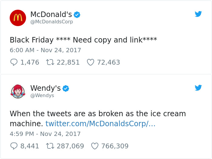
The last leader in business social media is the tried and true Twitter. Twitter works much like Instagram in that hashtags and @s quickly connect posts back to businesses, and it provides an effective platform for identifying customer problems and acting on them quickly. Twitter also famously restricts tweets to 240 characters or less, so while businesses need to be succinct, their content is quickly and easily digested by their followers. Twitter is also one of the fastest ways to spread news - an effective social media strategy gets your content engaged with first. It is also an excellent platform for sharing quick bits of information, such as promotions, store updates, and more. And, with a great social media manager businesses can enjoy free publicity (and business) at the expense of their competitors:
Now, is there a jack of all trades in the personal AND business social media business? If anyone is it it would be Facebook and Instagram. Their efficacy as business platforms is driven largely by the sheer volume of personal users - it's sink or swim really. Both platforms offer expansive connections, sharing of content, and more for both individuals and businesses. They are also effective at connecting businesses to people, and generating more leads and revenue.
For most of us, our first interaction with social media was personal. We'd heard about this new thing called MySpace where you could share posts on your wall, and also deeply personalize your space. You also got to find old friends on there, and everyone with inexplicably friends with Tom. I have to admit that I resisted joining MySpace until my hand was forced with a school project...and that was it. I was hooked with how easy it was to communicate and personalize. And as an introvert, it allowed me to do it all at a distance that was comfortable and controlled. Not too long after a little platform called Facebook appeared and social media as we knew it changed for good. As the hands-down leader of social media, Facebook brings a lot of strengths and unfortunately some downfalls too. But, on the whole, there is a reason it is the #1 social media site for personal use. Over its evolution it's added user-run groups for any special interest the mind could conceive, support for a variety of content formats, easy integration with other websites and apps, and powerful algorithms that help connect its users with people and information that are relevant to them. It's also added a sales platform recently and has firmly established itself as a one stop shop for bringing people together, connecting them to relevant information, and helping to build relationships. For personal use, Facebook reigns supreme and any user can tell you why. Facebook put MySpace out of business and is solidly on the way to sending Craigslist and online forums to their graves too.
But sometimes Facebook is just too...Facebooky. Concerns about privacy, annoyance at the barrage of content, and more has led to the success of other social media platforms for personal use too. Instagram (now owned by Facebook incidentally) offers a lightweight phone-only platform that does an effective job of filtering out the junk and presenting the information you want quickly through a heavy reliance on photos as content. The experience is as much of the product as the content. A lot of moms have made Instagram their go-to for social media because it effectively gets them the information they want and little else. On Instagram copy comes second, but the power really is in the hashtags and @s. They effectively connect content and allow you to explore on your own terms - it takes a few purposeful taps to wander into new discoveries. It's not forced on you. But, hashtags also do an effective job at giving the little guys a voice. Now, a fan of a product can tag the manufacturer and have a reasonable chance of getting a response. Or, content from regular people like you and me can get picked up and shared by the big guys. Never did I expect a retirement cake I made to show up on the official Star Trek page, but a few hashtags and you're famous for a moment.

The last platform I'd like to discuss is one that has definitely presented an overwhelming amount of content and sucked you in for hours...YouTube. In our cord cutting world YouTube has firmly established itself as a lightweight alternative to network television. Granted, you won't find big hits on there (at least for free), but you will certainly be connected to a variety of content - much of it created by regular people like you and me. Here, regular people can teach you a new skill, others can give an idea a voice, and even more can create long-running vlogs to document adventures, trials, or teach you the culture of a foreign place. Many think of YouTube as just a platform for cat videos, but as a personal user I can tell you the incredible things I've learned there - about cultures, how to be an ally to those with disabilities, and even how to fix my oven. For personal use, YouTube does an incredible job of connecting you with the information you want...and even more.
But what about the other side of social media? When it comes to business social media still reigns supreme, but in different ways. Instead of connecting businesses TO content, it serves businesses by connecting users to THEIR content. Given its 1 billion users, Facebook has the most users of any platform and the exposure businesses need. Added tools enable businesses to effectively use that exposure by way of business pages, reviews, maps, business hours and contact information, engagement metrics, and more. And, since everyone is already on Facebook it's not much effort to search out business information there. Or, business comes by way of users recommending a business and other users decide they'll give it a try too. Facebook allows businesses to share all kinds of content quickly and easily too - all from a powerful business page interface.
Another major player in the business social media field is LinkedIn. It operates much like Facebook with "friends" and "followers", but effectively maintains a professional atmosphere and limits oversharing. Here, businesses can tap into a vast database of personal profiles - each with skills and job experience listed - to recruit new talent, or to post jobs with useful management tools. Businesses can also post their own content and articles for their followers to digest and reshare if they like. This is not the place to post baby pictures - LinkedIn is all about quality, intelligent sharing and making businesses look good.
The last leader in business social media is the tried and true Twitter. Twitter works much like Instagram in that hashtags and @s quickly connect posts back to businesses, and it provides an effective platform for identifying customer problems and acting on them quickly. Twitter also famously restricts tweets to 240 characters or less, so while businesses need to be succinct, their content is quickly and easily digested by their followers. Twitter is also one of the fastest ways to spread news - an effective social media strategy gets your content engaged with first. It is also an excellent platform for sharing quick bits of information, such as promotions, store updates, and more. And, with a great social media manager businesses can enjoy free publicity (and business) at the expense of their competitors:
Now, is there a jack of all trades in the personal AND business social media business? If anyone is it it would be Facebook and Instagram. Their efficacy as business platforms is driven largely by the sheer volume of personal users - it's sink or swim really. Both platforms offer expansive connections, sharing of content, and more for both individuals and businesses. They are also effective at connecting businesses to people, and generating more leads and revenue.
Subscribe to:
Posts (Atom)